Agro Studio FW26 Beauty

Agro Studio FW26 Beauty

Agro Studio FW26 Beauty

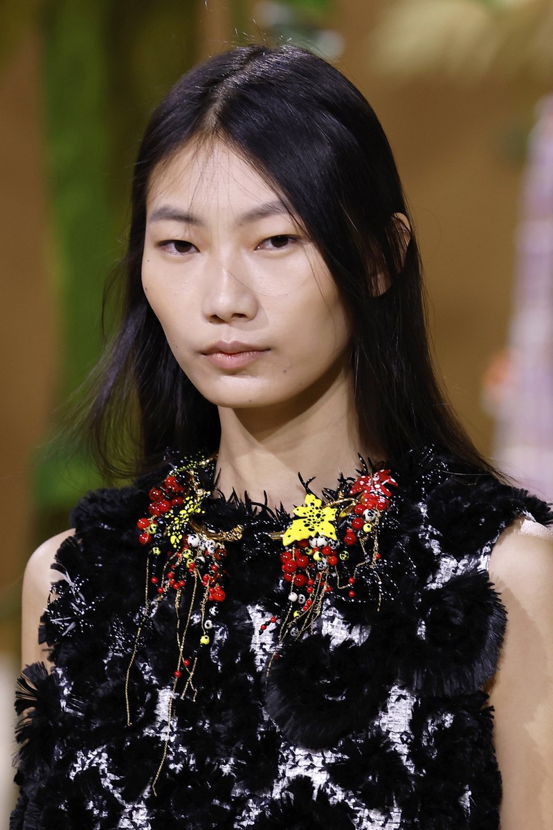
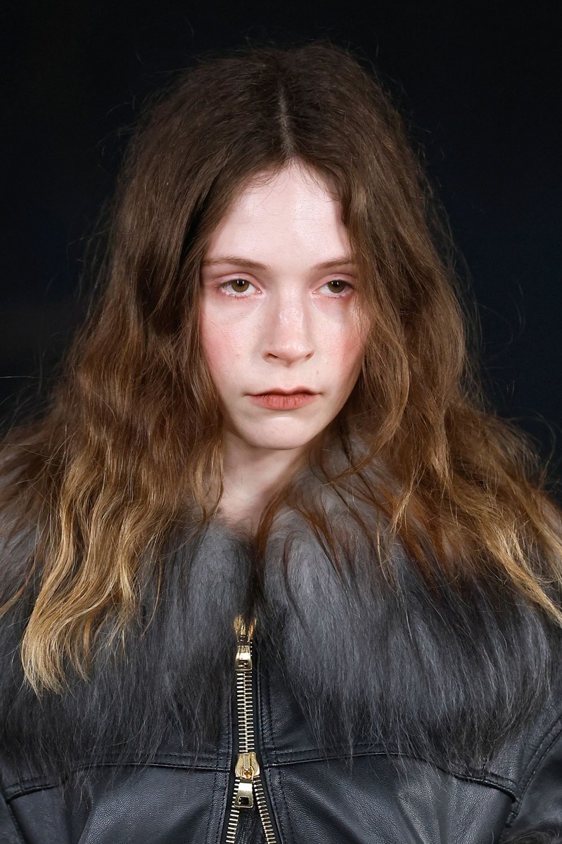
Agro Studio FW26 builds a beauty world around deliberate unfinish, pairing raw, uncombed texture with complexions that read closer to a bare face than a made face, broken only by selective moments of color placed with precision. For makeup artists and creative teams, this is useful reference for any brief that asks for "undone" but still requires a point of view.

Skin

Both looks carry a sheer to medium coverage base with a matte to satin finish, no visible luminizer, no strobing. Skin texture reads through in both photos, suggesting either a skin tint or a very lightly set foundation. The effect leans toward skin prep over product application, the kind of result that comes from good moisturizer and minimal color correction rather than a full coverage build.

Eyes

Photo 1 keeps the eye completely bare, no liner, no shadow, no mascara visible. The only color comes from what appears to be a faint pinkish flush at the inner corners and along the lower lash line, suggesting either deliberate staining with a sheer pink shadow or the red toned flush from the overall cheek work bleeding naturally toward the eye area. Photo 2 introduces structure with a smudged yellow green wash across the lower lid and inner corner, applied loosely with no hard edge, paired with what reads as a soft brown or taupe upper lid smoke kept low and close to the lash line. Brows in both photos are kept natural and unfilled, slightly sparse and ungroomed, which reinforces the raw skin direction across the entire show.

Photo 1
Photo 1

Lips

Photo 1 shows a bare to barely tinted lip, no clear product visible beyond the natural lip color, which reads as a faint warm pink. Photo 2 carries a sheer peach nude with a hint of gloss or a balm finish, slightly warmer than the natural lip tone, applied with no overline and no defined edge. In both cases the lip choice keeps the face open and unconstructed, letting the skin and eye work carry whatever intentionality exists in the look.

Cheeks and Color

Photo 1 places the most visible color on the face in a diffused pinkish red flush centered high on the cheekbones and bleeding toward the nose and lower eye area, applied with a wash technique rather than a targeted blush placement. Photo 2 is largely neutral at the cheek, with the yellow green eye placement doing the heavy lifting for any color expression on the face.

Hair

Photo 1 features long, unstyled waves left loose and voluminous with visible frizz and no product smoothing, a mid brown base with a warm honey blonde fade toward the ends that reads as grown out balayage rather than a deliberate color job. Photo 2 takes a copper auburn all over, worn with a center part and a loose, almost deflated volume at the crown, the kind of shape that suggests hair was set and then slept in. Both looks share the same anti finish philosophy as the skin and makeup, hair that has been handled but not resolved.

Photo by Photo

Photo 1 The pinkish red flush placed high and wide across the cheeks and bleeding into the inner eye corners is the single most directional element in the look, a monochromatic skin stain technique that reads as accidental but requires deliberate placement.

Photo 1 With no eye makeup present, the flushed, textured skin base stands alone. This is strong reference material for any brief where the face needs to look like it has been outside rather than in a makeup chair.

Photo 1 A fur collar frames the raw face and makes the beauty direction read harder. The contrast between a dressed up textile and an undressed face is a clear creative intention for editorial or campaign concepting.

Photo 2 The yellow green lower lid wash is specific and rare as a directional color choice, landing somewhere between bruise and botanical, applied with enough diffusion that it avoids graphic or editorial territory and stays in wearable strangeness.

Photo 2
Photo 2

Photo 2 A warm peach lip paired with a cool toned green eye creates quiet chromatic tension that holds the face together without relying on a neutral lip as a default.

Photo 2 Flag the ungroomed, slightly overgrown brow in both photos specifically for brow product teams. The shape here is not the clean feathered soap brow that dominated recent cycles, it is genuinely unmanaged and that distinction is meaningful.

Photo 2 Copper auburn hair against cream white fur reads as a deliberate tonal pairing, warm against warm. Art directors building mood boards for autumn campaigns will find this combination useful as a color story reference.

✦ This report was generated with AI — combining human editorial vision with Claude by Anthropic. Because the future of fashion intelligence is already here.