FILA FW26 Women Looks Report
Milan Fashion Week
FILA FW26 collapses the boundary between athletic heritage and tailored dressing, building a wardrobe around the idea that sportswear codes and office-adjacent structure can occupy the same garment at the same time. For buyers navigating a market where the consumer wants versatility without visual compromise, this collection delivers a clear and commercially legible answer.
Silhouette and Volume
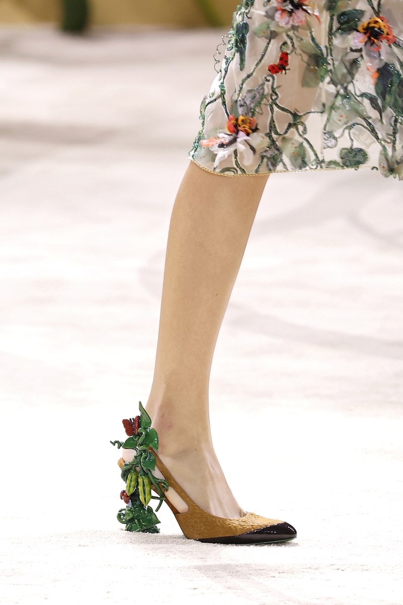
Two dominant shapes anchor the collection: a boxy, cropped outerwear volume sitting above a knee-length skirt, and a longline coat that reads as properly tailored from a distance but carries technical zipper and pocket details up close. Skirts in Looks 2, 4, 6, 8, 11, 13, 15 and 18 land consistently at the knee with pleated or wrapped constructions that allow ease of movement without collapsing into sportswear informality. Shorts appear in Looks 15 and 18 as a cleaner, warmer-weather reading of the same midi-length proportional logic. Volume is controlled and purposeful, never oversized for its own sake.
Color Palette
Red and navy anchor the first third with high contrast and clear brand recognition, as seen in Looks 1 and 2 with the crimson wool coats and in Look 9 with the electric cerulean scarf against deep navy. From Look 13 onward, the palette shifts into sage green, stone, warm khaki and oat, creating a muted earthy register that widens the commercial range considerably. The tan leather bomber in Look 8, set against a red knit and a black skirt, demonstrates how FILA uses color blocking as a structural tool rather than a decorative one. Grey in multiple temperatures, cool mid-tone to charcoal, threads through the entire show and acts as the collection's neutral spine.

Materials and Textures
Wool cloth in a smooth, medium weight carries the coats in Looks 1, 4 and 19, and it reads with enough quality to position these pieces above the mass-market sportswear tier. Full-grain leather appears in the tan bomber in Look 8 with a soft hand and relaxed sleeve, not stiff, which is a critical detail for fit and wearability in a retail context. Technical nylon in a matte finish appears in the jackets of Looks 15 and 17, adding a lighter, packable option that extends the collection's seasonal range. Fine-gauge knitted polo tops in Looks 13, 16 and 18 use subtle tonal striping that keeps the sportswear reference present but refined.

Styling and Layering
Layering a zip-front base layer beneath an open outer garment creates visual depth while communicating modularity to the consumer. Black leather gloves appear across nearly every look, functioning as a unifying accessory that ties tailored and sporty pieces together and signals that this collection is positioned for a cooler climate and a considered customer. Footwear splits between two directions: white low-profile sneakers or mary-jane-adjacent flats that lean preppy, and grey or white sock-boot hybrids that soften the tailored pieces. Striped ties appear on both men and women throughout, used as a pointed reference to school uniform dressing that adds specificity and sharpness to otherwise quiet silhouettes.
Look by Look Highlights
Look 2 The crimson bouclé-finish short jacket over a white shirt, striped tie, black wrap skirt and black leather gloves is the most complete and immediately buyable women's look in the collection, with every component functioning independently.

Look 4 A longline black wool coat worn open over a grey midi skirt, white shirt and quilted inner layer creates a layering story that a style director can translate directly into an editorial or a shop-floor outfit build.

Look 6 An oversized grey wool blazer with contrast zip-pocket hardware over a light blue Oxford shirt and a pleated dark grey skirt is the strongest suiting proposition in the collection, structured enough for corporate adjacency but relaxed enough to avoid formality.

Look 8 The tan full-grain leather bomber over a red rib-knit crewneck, black wrap skirt and burgundy bag produces the collection's most commercially potent color combination, with the leather quality doing significant work for the price-point conversation.
Look 11 A blue and white geometric color-block sweatshirt worn over a white turtleneck with a belted black skirt featuring a blue inset panel demonstrates the collection's capacity for print and pattern as a category extension with direct appeal to the streetwear-adjacent buyer.

Look 15 Head-to-toe sage green styling, a technical nylon zip jacket, a matching green shirt with a tonal striped tie and pleated shorts, reads as a full set that a product manager can price and merchandise as a coordinated unit.

Look 18 A fine linen-blend polo worn over a white collared shirt, belted above a khaki pleated skirt with white ankle socks and red-and-white running shoes, captures the collection's ease-into-sport sensibility most cleanly and sits at the lowest production complexity of any female look shown.

Look 19 The camel single-button wool coat, a piece that stands entirely outside the athletic reference, over black leather trousers signals that FILA is testing the boundary of its brand equity and that a standalone outerwear program could carry weight with a luxury-adjacent wholesale partner.

Operational Insights
Outerwear as hero SKU: Wool coats in Looks 1, 2, 4 and 19 carry the highest perceived value in the collection and should be prioritized for flagship and wholesale channel placement, with attention to medium-weight wool sourcing that supports a mid-to-premium retail price without inflating production cost.
Co-ord potential: Looks 15 and 17 present complete two-piece sets in matching technical nylon that require minimal styling effort at retail and perform well in digital commerce environments where the consumer wants a complete look with a single purchase decision.
Accessory program depth: The leather glove appears in nearly every look and functions as a brand signature with strong margin potential. Buyers should assess whether the glove can be brought into the accessory assortment as a standalone SKU with the same stitching and finish language seen on the runway bags.
Color phasing for delivery: Red and navy looks read as an early-season or pre-season drop, while the sage, khaki and stone palette from Look 13 onward is better positioned for a mid-season or transitional delivery window, which allows the buy to be phased across two purchase orders.

Footwear crossover opportunity: The white low-profile sneaker appears repeatedly across both men and women and is already legible as a FILA archetype. Style directors should consider how this silhouette, when styled with skirts and gloves as seen in Looks 2 and 6, repositions existing sneaker stock for a fashion-forward female customer without requiring new product development.
Complete Collection


About the Designer
Levent James Tanju was born in Croydon, south London, to a Turkish father who had been a professional footballer and an English mother who ran a restaurant in Clapham popular enough to attract Jack Nicholson as a regular. He grew up between those two worlds: the competitive discipline of sport and the warm chaos of a family business where everyone worked. He picked up a skateboard at 17, after a friend from school got one and it looked like fun. He saved up wages from the restaurant, bought a board from a shop on the King's Road, and within a short time had failed most of his GCSEs, quit school, and moved into the orbit of London's Southbank skate scene, which in the early 2000s was producing some of the most interesting creative energy in British youth culture.
He spent the better part of a decade skating, filming his friends on a Motorola flip phone, and making small lo-fi video series under the Palace Wayward Boys Choir collective. It was less a career path than a way of life that eventually demanded a name. In 2009 he co-founded Palace Skateboards with Gareth Skewis and Marshall Taylor, commissioning graphic designer Fergus Purcell to create the brand's now-iconic triangular logo. Palace grew from a single T-shirt line sold around independent London boutiques into one of the most influential streetwear brands in the world, driven by a stubborn refusal to look anywhere but inward: English music, London streets, real skaters, no pretense.
In January 2024, Tanju accepted his first external creative director role, taking charge of FILA+, a new premium line launched by the century-old Italian sporting brand. It was the first time he'd said yes to that kind of offer, and the reason was essentially personal: a trip to Fila's archive in Biella, a small manufacturing town in northern Italy, where he found decades of objects that genuinely excited him. The Björn Borg tennis uniforms, the climbing gear designed for Reinhold Messner, the founding creative director Pierluigi Rolando's obsessive drive toward innovation within sport. Tanju reworked the brand's logo to reflect the Italian flag more clearly, shot his first campaign in the Tuscan countryside with photographer Ryan McGinley, and presented his second collection in a former industrial space in Milan, filling it with characters rather than models, scenes rather than shows.
"FILA has such a rich and amazing history spanning over a hundred years. I was blown away by how vast the archive was, and loved all of it."
"My taste and the direction I tend to go in are bold and a bit funny, with some irony, and it's impossible for me personally not to do that."
✦ This report was generated with AI — combining human editorial vision with Claude by Anthropic. Because the future of fashion intelligence is already here.