Simon Cracker FW26 Women Looks Report

Simon Cracker FW26 Women Looks Report

Simon Cracker FW26 Women Looks Report

Milan Fashion Week

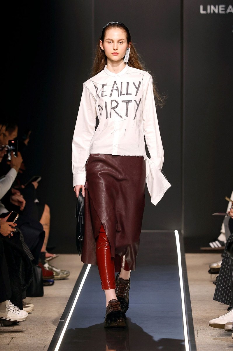
Simon Cracker FW26 builds a wardrobe from deliberate damage, graphic noise and material contradiction, placing distressed leather against raw-edge shirting, shearling collars against vinyl leggings, and slogan text against structured outerwear. For buyers navigating a market fatigued by polish, this reads as a commercially viable entry point into the anti-luxury mood gaining ground across European and Asian wholesale.

Silhouette and Volume

A mid-length, column-skimming silhouette dominates the bottom half, paired with oversized, dropped-shoulder volume on top. Coats in Looks 12 and 14 push to cocoon proportions. Cropped or boxy jackets in Looks 3 and 16 shorten the torso aggressively. Nearly every look grounds itself below the knee with leggings and ankle-cropped trousers, preventing the volume from reading as costume. Wide through the shoulder, narrow from the hip down, the proportion remains consistent throughout.

Color Palette

Burgundy, mustard yellow, raw camel and black anchor the collection across both womenswear and menswear looks. Deep oxblood vinyl pairs with blush or white cotton in Looks 1 and 4, creating a tension between rawness and softness. Acid green appears in Look 17 as a vinyl skirt, sharp enough to function as a statement separate. Most market-ready is the recurring pairing of mustard with black, visible in Looks 2, 15 and 16.

Look 17
Look 17

Materials and Textures

Vinyl and lacquered leather dominate, appearing as both leggings and skirts with a surface quality that reads wet and reflective under runway lighting. Shearling returns repeatedly, dyed in dusty sage, camel, pale blue and burnt orange, cut into oversized collars that function as standalone accessories. Cotton shirting appears deliberately aged or stained, particularly in Looks 1 and 3, where the fabric looks handled rather than manufactured. Between the stiff, coated surfaces and the soft, looped shearling lies the defining material logic of this collection.

Styling and Layering

Layering is additive and deliberately mismatched: a furry vest over a crinkled cotton shirt in Look 4, a shearling collar dropped over a utility parka in Looks 9 and 11. Large, unstructured bags in yellow or tan function as color-blocked accessories rather than refined leather goods. Footwear ranges from lace-up platform boots to sculptural yellow mules with face motifs in Look 16, with no single shoe category dominating. Nearly every component can be merchandised away from the runway look and still carry the collection's point of view, rewarding buyers who think in separates.

Look 4
Look 4

Look by Look Highlights

Look 1 The white cotton button-down printed with "REALLY DIRTY" in hand-drawn lettering, layered over burgundy vinyl leggings and a matching lacquered midi skirt, establishes the core tension between graphic provocation and composed dressing.

Look 1
Look 1

Look 3 A camel leather jacket with heavy staining, worn over illustrated black vinyl trousers, signals the "used luxury" market directly to buyers, where surface treatment replaces ornament.

Look 3
Look 3

Look 5 The patchwork cape combining floral velvet, rose-dyed shearling and a yellow fur collar worn over a black blazer and illustrated red vinyl trousers is the most editorial statement in the collection, built for press imagery rather than volume orders.

Look 5
Look 5

Look 7 The tan parka with asymmetric blue and taupe shearling collar worn open over a neon yellow crop top and black lacquered leggings is the clearest commercial outerwear formula in the women's lineup, with the collar functioning as an immediately detachable SKU.

Look 7
Look 7

Look 12 A mid-length grey herringbone coat with toggle closures, worn over an orange silk top and illustrated black vinyl trousers, carries the broadest wholesale appeal, pairing a conventional silhouette with disruptive accessories and legwear.

Look 12
Look 12

Look 15 The olive and brown leather jacket covered in hand-drawn imagery, graffiti text and eye symbols, paired with a yellow fringed skirt, signals a clear product category for buyers targeting the grunge-adjacent streetwear customer.

Look 15
Look 15

Look 16 An oversized camel suede bomber with bleached chest panel, worn over black vinyl shorts and a draped yellow lacquered skirt, with face-motif yellow mules, is the most cohesive head-to-toe buy for concept stores and multibrand boutiques.

Look 16
Look 16

Look 19 The white long-sleeve "REALLY DIRTY" sweatshirt paired with a yellow taffeta bow-front mini skirt and illustrated sheer tights completes the slogan knitwear loop opened in Look 1 and is the most accessible entry price point in the collection for new buyers.

Look 19
Look 19

Operational Insights

  • Slogan separates The "REALLY DIRTY" text appears on both a structured shirt in Look 1 and a jersey sweatshirt in Look 19, creating a repeatable graphic that can be licensed across categories without requiring heavy fabrication investment from retail partners.
  • Shearling collars as detachable units Across Looks 7, 9, 11, 14 and 18, the shearling collar functions structurally as a separate piece. Confirm with the brand whether these are sold independently, as they represent a high-turn accessory with strong gifting potential.
  • Vinyl legwear as a volume driver The illustrated vinyl legging appears in at least six looks across both genders. Motifs including faces, graffiti text and figure drawings suggest a licensed print program. Assess minimum order quantities on this fabrication before committing to assortment depth.
  • Distressed leather outerwear Looks 3, 15 and 16 all rely on surface treatments that simulate wear, staining or bleaching. Verify whether this effect is applied post-production or built into the garment construction, as that distinction affects reorder consistency and quality control expectations significantly.
  • Colorblocking in accessories Yellow bags appear in multiple looks and read as a designed signature, not a styling choice. Pair this accessory color with the grey herringbone coat from Look 12 or the black parka from Look 18 for immediate floor impact without requiring full look adoption.

Complete Collection

Look 2
Look 2
Look 6
Look 6
Look 8
Look 8
Look 9
Look 9
Look 10
Look 10
Look 11
Look 11
Look 13
Look 13
Look 14
Look 14
Look 18
Look 18
Look 20
Look 20
Look 21
Look 21
Look 22
Look 22
Look 23
Look 23
Look 24
Look 24
Look 25
Look 25
Look 26
Look 26
Look 27
Look 27
Look 28
Look 28
Look 29
Look 29
Look 30
Look 30
Look 31
Look 31
Look 32
Look 32
Look 33
Look 33
Look 34
Look 34
Look 35
Look 35
Look 36
Look 36
Look 37
Look 37
Look 38
Look 38
Look 39
Look 39
Look 40
Look 40
Look 41
Look 41
Look 42
Simone Botte

About the Designer

Simone Botte was born on September 27, 1985, in Cesena, a mid-sized city on the Adriatic coast of northern Italy, in a family where making things by hand was simply what people did. His grandfather repaired and repurposed objects rather than discarding them, teaching by example that use was more honorable than waste. His mother and grandfather painted. He absorbed the household logic of giving second lives to worn-out things, a logic that would eventually become the structural principle of everything he built. He enrolled in graphic design, working initially as a graphic and pattern designer for a fashion firm servicing major brands, but the work felt insufficient. The creative problem he was trying to solve required something that moved, that could be inhabited by a body.

He began making accessories from upholstery fabric, not to sell them but simply because he needed to make them. He gave them to friends, and shops started asking to stock them. He relocated to London, working with students at Central Saint Martins, and returned to Italy in 2010 resolved to do something with a fixed objective. Simon Cracker launched that year at Paris Fashion Week, showing a tailored collection at the Palais Pierre Cardin and immediately finding buyers in Tokyo, Osaka, and Hong Kong. The Japanese market responded to what he was doing with materials and geometry: a fashion without seasonal obligation, without gender restriction, without the pretense that newness requires consumption. While running the brand, he has continued to work as a stylist and art director for MSGM, Jo No Fui, Who's Who, and other Italian labels.

In 2020 he was joined by co-creative director Filippo Leone Maria Biraghi, a fashion curator, buyer, and lecturer in fashion culture, and the brand entered the Camera Nazionale della Moda Italiana's official calendar from 2021. Every Simon Cracker collection is built from deadstock fabrics, garments discarded by other brands, and waste materials: not as a positioning statement but as the only method of working that makes ethical sense to him. His grandfather's influence is explicitly named as the source of the brand's core practice. The shows are dense, chromatic, and deliberately non-normative, with models chosen for their individuality rather than their conformity, the runway functioning as what Botte calls a parade, a place to scream through cloth.

"My fashion shows are my parades, so I can speak and I can scream with my clothes and with my collections. Really it's just all of my emotions coming out."

"It was my grandfather who inspired us with the idea of upcycling; he was the one who taught me how to give a second chance to already used objects."

✦ This report was generated with AI — combining human editorial vision with Claude by Anthropic. Because the future of fashion intelligence is already here.